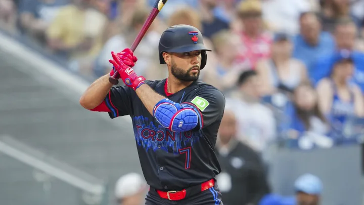

The Toronto Blue Jays revealed their City Connect jerseys, named “Night Mode,” during a launch event downtown on May 31st. This new uniform features the city skyline in blue, prominently showcasing landmarks like the CN Tower and Rogers Centre against an all-black backdrop, with “TORONTO” boldly displayed across the chest. This marks the first time since 1999 that the city’s name has been featured on the front of their uniforms.
The Athletic recently ranked all 29 City Connect uniforms, stirring up considerable discussion and debate. Among the eight teams debuting new designs this season, the Blue Jays’ “Night Mode” placed disappointingly at #19 with an average score of 17.75. This ranking places them just ahead of the Mets and closely behind the Diamondbacks.
Critics expressed mixed views on the Blue Jays’ design. Tyler Kepner noted the lack of white outlines, which he felt could have enhanced the clarity of the skyline motif, particularly from a distance. He also criticized the overused black-on-black color scheme. Conversely, Trent Rosencrans initially had strong reactions ranging from excitement to disappointment but found the on-field debut more favorable than expected. Jason Jones appreciated the design but suggested it might have stood out better against a lighter background.
Despite varying opinions, many felt the Blue Jays deserved a higher ranking, considering the effort put into the concept compared to other teams’ designs. Ultimately, rankings are subjective, and fan reactions continue to shape the discussion surrounding these new uniforms.
GET MORE NEWS HERE